Viettel Post Mobile App
Viettel Post is Vietnam's leading delivery platform, serving millions of personal and business users through a nationwide logistics network.
Role
Co-Lead Product Designer
Team
Team of 6 designers
Timeline
01 month - phase 01
Outcome & impact
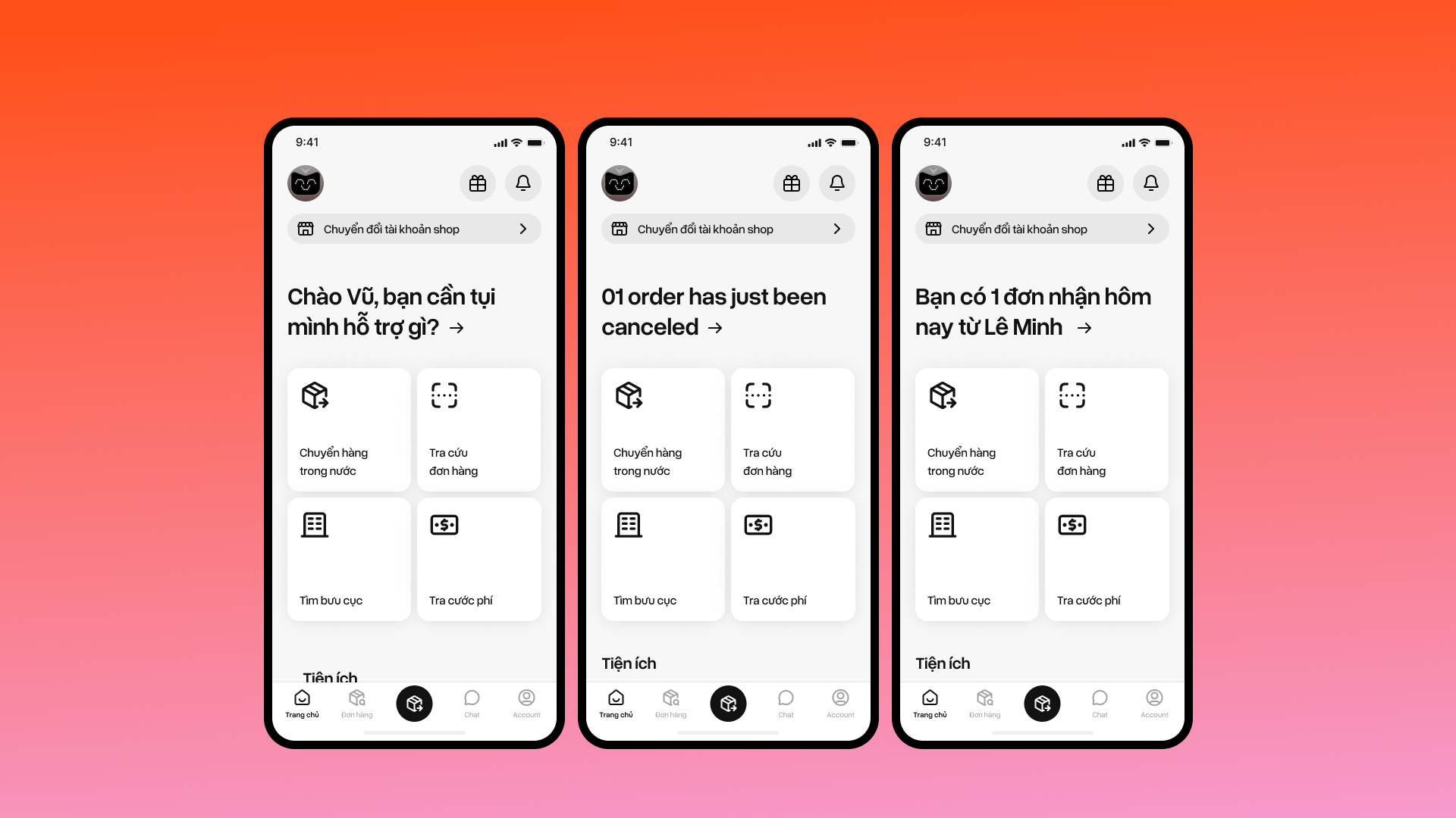
We delivered Phase 1 within the one-month window. The output gave Viettel Post a clearer IA foundation, dev-ready mobile flows, and a UI direction that later phases could build on.
1 month
Phase 1 timeline from research to high-fidelity direction
6
Designers co-led through the redesign cycle
2
Primary user models separated: personal and SME
Phase 1
IA, ticket creation, and UI patterns lay the foundation for next phase
The challenge
Viettel Post was a large mobile app serving personal senders and SME shops. The app had grown with news, promotions, mini games, and business campaigns that competed with the jobs people opened the app to do: create a delivery, track a package, and manage COD.
Research and insights
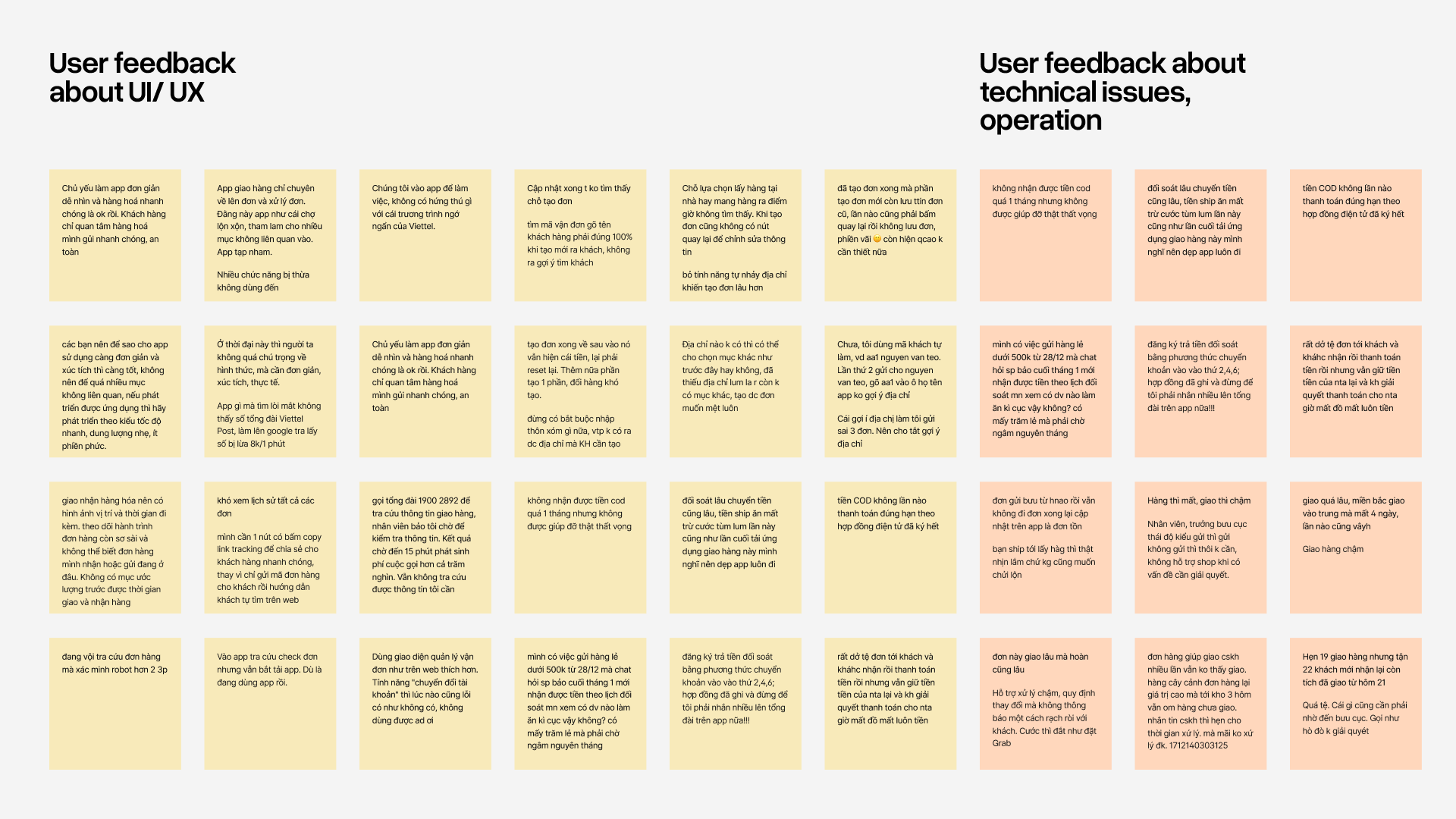
With a short timeline, we focused on user reviews, support-style feedback, existing app flows, and competitor patterns from GHTK, J&T, Grab, and Shopee.
Key finding
The existing flow required users to create an account before they could begin the delivery process. This interrupted users before they had achieved any value, increasing the likelihood of abandonment — especially for first-time or occasional users who simply wanted to send a package quickly.
Solution
01
Redefine the IA around user intent
Instead of reorganizing features by business category, we reorganized the experience around what users actually came to accomplish.
Two distinct user models emerged: personal senders, who prioritized simplicity and confidence, and SME sellers, who needed speed, repeatable actions, and operational efficiency.
02
Show value before asking to sign up
We redesigned the delivery flow using progressive disclosure. Users could build a delivery ticket first, while registration was delayed until the moment an account actually became necessary.
Design
Take away
With a one-month timeline, speed required precision, not guesswork. We anchored decisions in real user friction, flow audits, and competitor patterns to identify high-impact simplifications, translating them into a clear information architecture and a solid Phase 1 foundation.
This reinforced a core principle: foundations shouldn’t be deferred. Data-driven prioritization keeps teams aligned under pressure and ensures each phase builds on something structurally sound, not assumptions.